Bodhita Font Review: Minimalist Type for Web Design
I was recently deep in the wireframing phase for a wellness coaching client’s rebrand when I hit a familiar design wall. The layout was structurally sound, and the color palette was perfectly muted, but the hero section felt sterile. It lacked that specific human touch that digital brands in the lifestyle space desperately need to establish trust. I didn't want another standard script that looked like it came from a generic template, nor did I want a rigid sans serif that felt too corporate. That is when I decided to test Bodhita as the primary display typeface for the site’s main headline.
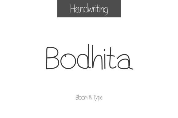
The result changed the entire mood of the landing page. Bodhita is a minimalist handwritten font that manages to balance simplicity with modern charm in a way that translates surprisingly well to screen. With its thin lines, tall structure, and soft rounded edges, this typeface conveys a lighthearted yet sophisticated tone. As a web designer who obsesses over both aesthetics and user experience, I found Bodhita to be a refreshing addition to my digital typography toolkit. It bridges the gap between organic handwriting and clean UI design, making it an excellent candidate for boutique online stores, portfolio sites, and personal brand platforms.
Visual Hierarchy and Hero Section Performance
In web design, the hero section has roughly three seconds to communicate value and vibe. When I implemented Bodhita in a large-scale header (around 80px to 120px depending on the viewport), the tall x-height and vertical stress of the letterforms created an immediate sense of elegance without sacrificing legibility. Many handwritten fonts fail at this scale because their irregularities become distracting or their connections look messy when stretched. Bodhita, however, maintains its structural integrity.
The thin strokes require careful handling regarding contrast. During my testing, I found that Bodhita performs best against solid, high-contrast backgrounds. A dark charcoal background with white Bodhita text created a stunning, premium editorial look for a course sales page. Conversely, when placed over a busy lifestyle photograph, the thin lines struggled to maintain definition even with a drop shadow. For image overlays, I recommend using a semi-transparent color block behind the text or reserving Bodhita for areas with ample negative space. This ensures the minimalist aesthetic remains crisp and accessible across different devices.
Responsive Behavior on Mobile Viewports
A beautiful desktop font can quickly become a usability nightmare on mobile. Because Bodhita features delicate line work, scaling it down requires intention. On smaller screens, I adjusted the tracking slightly tighter to prevent the letters from feeling disjointed, while increasing the line height to accommodate the tall ascenders and descenders. At sizes below 24px, the thin strokes began to disappear on lower-resolution displays, which brings us to a crucial UX consideration: accessibility.
Bodhita is strictly a display font. It should never be used for body copy, navigation menus, form labels, or dense informational content. Its role is to act as a visual anchor—a moment of pause and personality amidst functional interface elements. For the coaching site, I paired Bodhita exclusively with a geometric sans serif for all interactive elements and long-form reading. This pairing strategy not only preserved the artistic intent of Bodhita but also ensured the site remained WCAG compliant and easy to navigate. The contrast between the organic display font and the structured body font created a dynamic rhythm that kept users engaged without causing cognitive fatigue.
Strategic Font Pairing for Digital Brands
Typography is relational; no font exists in a vacuum. Bodhita’s minimalist nature makes it incredibly versatile for font pairing, but it demands a partner that provides stability. Because Bodhita leans toward the decorative side of the Script Amp category, your secondary typeface should do the heavy lifting for readability.
- Clean Sans Serif: Pairing Bodhita with a neutral sans serif like Inter, DM Sans, or Outfit creates a modern, approachable tech-meets-lifestyle aesthetic. This is ideal for SaaS founders with a personal brand or digital product creators selling templates.
- Elegant Serif: For a more editorial or luxury feel, combine Bodhita with a high-contrast serif like Playfair Display or Cormorant Garamond. This combination works beautifully for wedding planners, high-end boutiques, and literary portfolios.
- Monospace Accent: For a trendy, Gen-Z focused creative agency site, try pairing Bodhita with a monospace font for metadata, captions, and button text. The juxtaposition of the fluid script and the rigid mono grid signals cutting-edge modern typography.
When designing digital assets like social media graphics or blog headers, remember that Bodhita carries significant visual weight despite its thin lines. Avoid adding other decorative elements like swirls, excessive icons, or textured overlays near the text. Let the typeface breathe. In my experience, the most effective use of this font in web layouts involves generous whitespace. Crowding Bodhita diminishes its premium quality and makes the interface feel cluttered rather than curated.
Practical Considerations for Web Implementation
Before committing Bodhita to a live project, there are several technical and licensing factors to verify. As with any commercial font used in web design, you must ensure you have the appropriate webfont license. Desktop licenses typically do not cover @font-face usage on live websites. Check the foundry’s terms regarding page views, domain limits, and whether the license extends to client projects or digital products you intend to sell.
From a performance standpoint, handwritten fonts can sometimes have larger file sizes due to complex glyph data. Always subset your webfonts to include only the characters necessary for your specific language and content. If you plan to use Bodhita’s alternates, ligatures, or swashes in your CSS, verify that the webfont kit includes OpenType feature support. Some browsers handle stylistic sets differently, so test thoroughly across Chrome, Safari, and Firefox. I also recommend having a reliable fallback stack defined in your CSS. Since Bodhita is unique, a generic cursive fallback will likely look jarring. Instead, map it to a system-safe serif or sans serif that matches the general proportions to prevent major layout shifts during loading.
Where Bodhita Shines and Where to Pause
After integrating Bodhita into multiple digital environments, I have developed a clear mental model for where it adds value and where it detracts from the user experience. It is exceptionally strong for:
- Landing Page Headlines: Short, emotive phrases that set the tone immediately.
- Signature Elements: Mimicking a founder’s signature in an "About" section or footer to build personal connection.
- Digital Product Mockups: Adding realistic branding to ebook covers, workbook PDFs, and course thumbnails.
- Promotional Banners: Seasonal announcements or limited-time offers where a human touch increases conversion appeal.
- Logo Text: Wordmarks for creative businesses that want to appear established yet accessible.
Conversely, avoid using Bodhita for functional UI components. Buttons, navigation links, breadcrumbs, and form inputs require instant recognition. The cognitive load required to decipher stylized letterforms in these contexts creates friction that harms conversion rates. Similarly, if your website targets an audience with visual impairments or relies heavily on screen readers, keep Bodhita purely decorative and ensure semantic HTML tags convey the actual meaning of the content regardless of the visual presentation.
Ultimately, Bodhita is a tool for emotional resonance in a digital landscape that often feels cold. It allows web designers to inject authenticity without resorting to cliché. Whether you are building a portfolio, refreshing an e-commerce store, or launching a digital course, this typeface offers a distinct voice that feels both intentional and effortless. Just remember to treat it as the jewelry of your design system—sparingly placed, highly visible, and always supported by a solid foundation of functional typography. When used with this level of intentionality, Bodhita transforms standard web layouts into memorable brand experiences that resonate with modern audiences seeking genuine connection.